
 Sahand Nayebaziz
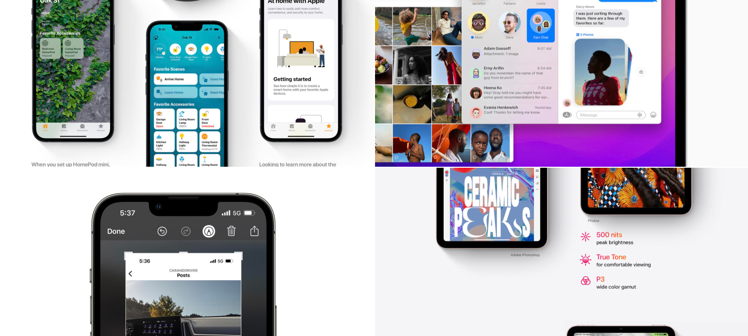
Every Friday, we post curated links for user interface designers interested in iOS design, macOS design, and more on our newsletter UI Designer Weekly. You can read each post here or sign up for the weekly email.

Beautiful Displays Can Be Buttons Too
Home on iOS 15 makes a beautiful display of a lot of information. By simply lighting up the rounded rectangle and the visual elements representing one of your Home scenes, it tells you that the scene is active and the others are not. Home uses these visual elements as buttons too, where simply tapping takes you to more about that home device. Key takeaways here I believe are that we shouldn’t be afraid of loading up visual elements in our designs with multiple meanings and multiple uses—it may be true that the people using our designs come to them with multiple reasons depending on the time of day or what they were doing just before, and our designs can keep that in mind.

More Beauty in a Smaller Space
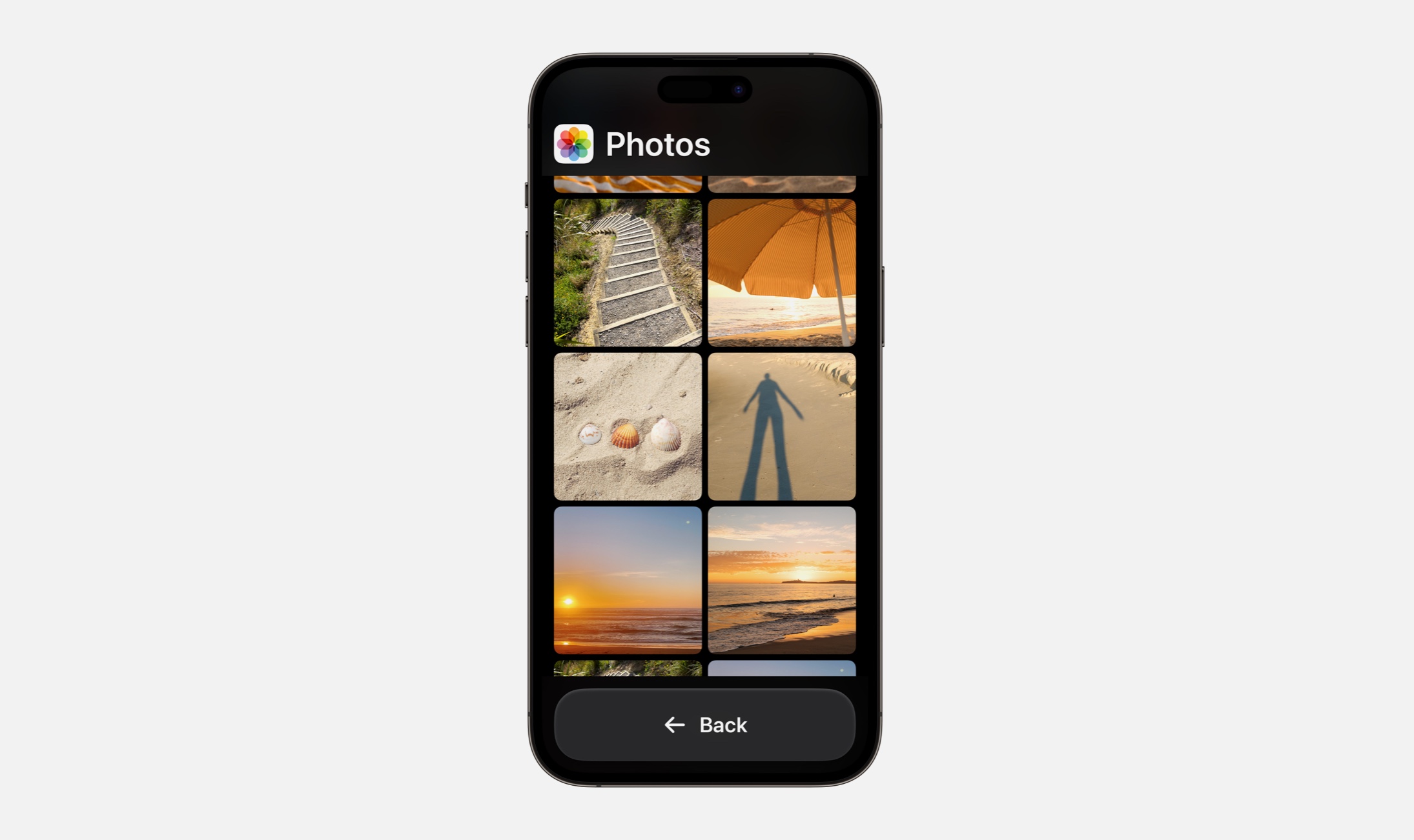
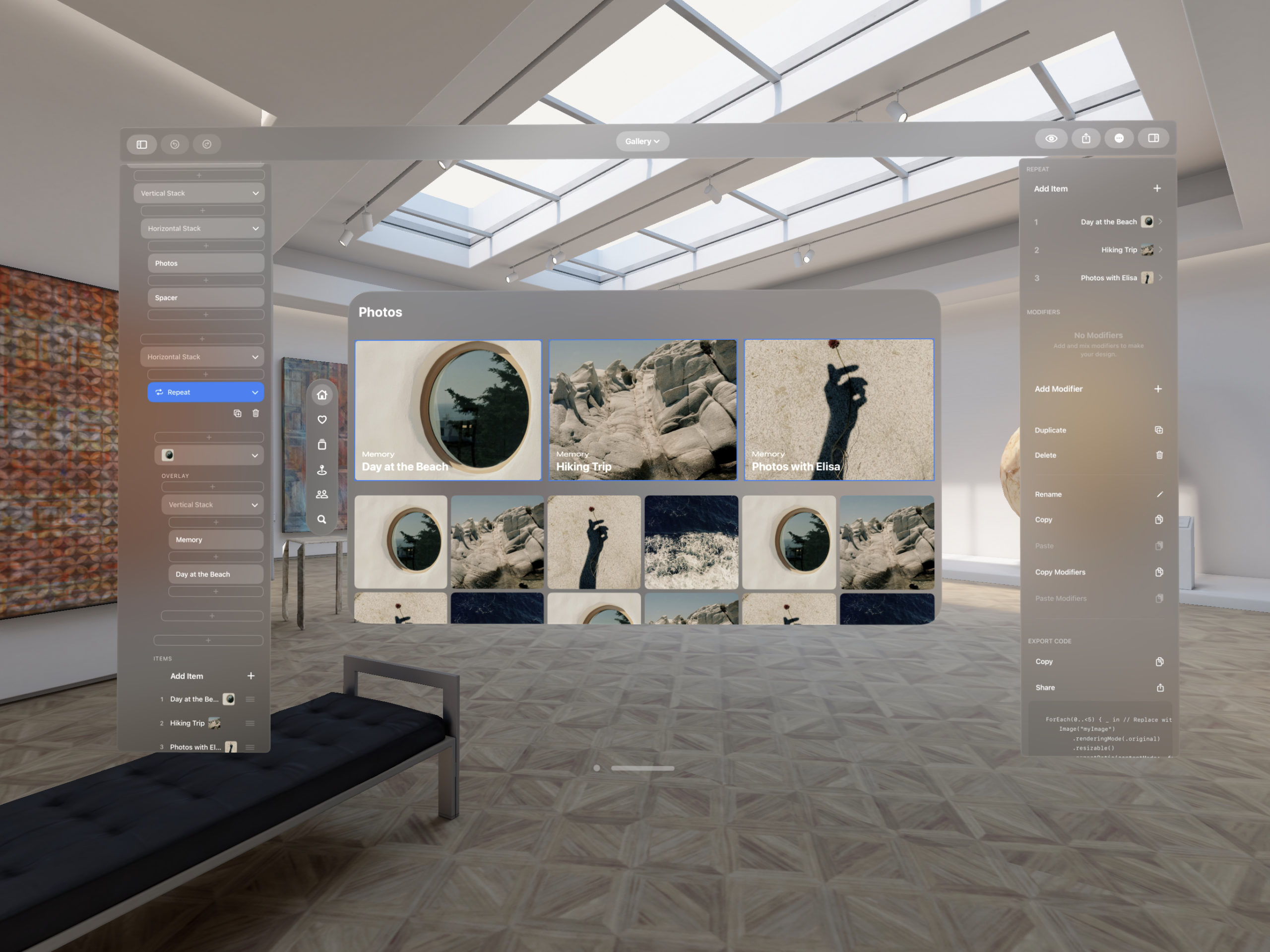
Pictures stack together in Messages on macOS Monterey. For me, Apple Design strikes its most triumphant notes when its interfaces bring in elements of the real world. It may seem something so simple, but this new way of showing pictures is beautiful while also being better in many ways: a set of pictures now takes up just one spot in the conversation instead of taking up a long scroll; you can quickly tap and flick through the set of pictures without losing your spot in the conversation; did I mention it’s beautiful?

Between Elements, Design with Difference
Screenshots and Markup on iOS 15. Along the top, visual elements for each button are all in the same light color that has great contrast on the darker, blurred background. This design shows us with the way the markup icon is currently highlighted with a white circle background that we can use very simple, almost tiny differences to communicate in our designs. For example, nowhere on the screen does it currently say “Markup” or “Markup Mode”; it’s just the pen having a white circle highlight behind it. Also noteworthy that there is a delete button right there at the top with all of the other actions. If deleting was a common action that people wanted to take here, it makes sense to include that right away at the same level, instead of after a “…” tap, for example.

Less is More
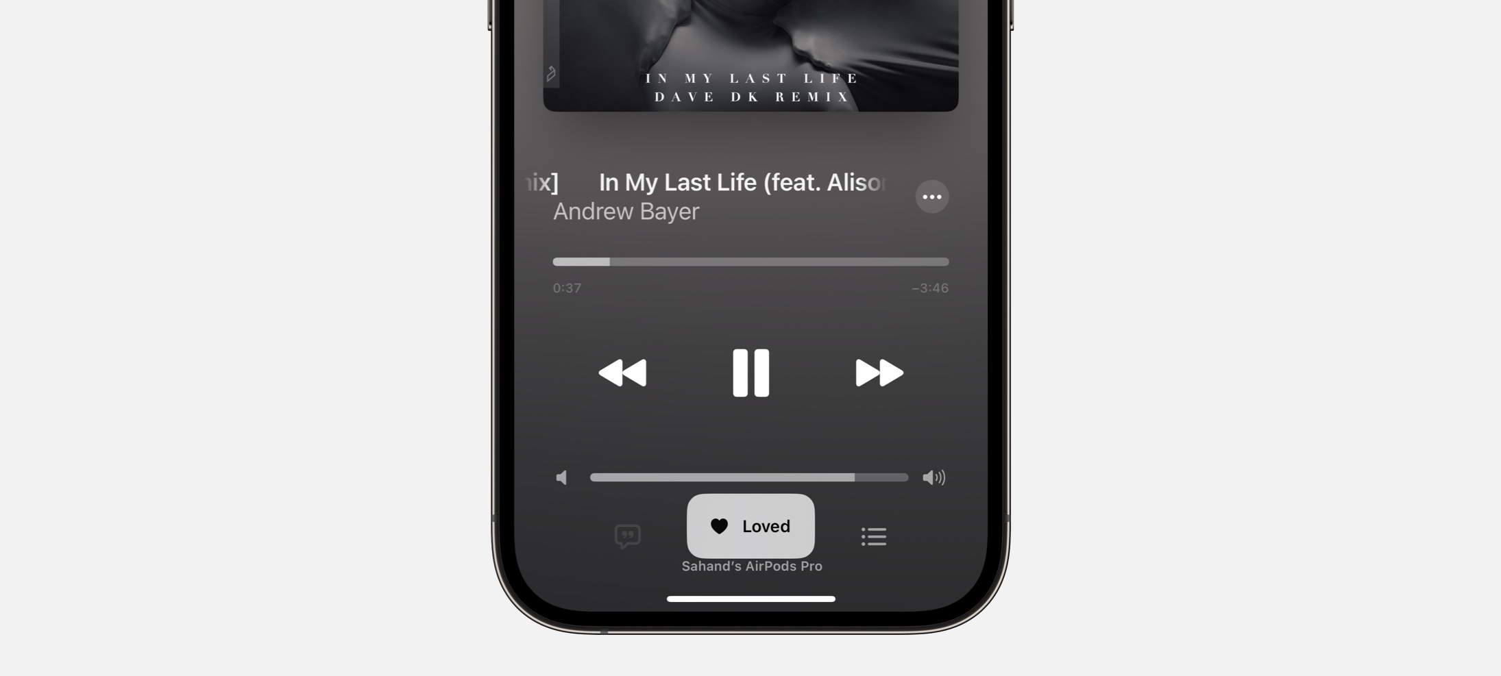
On the topic of simplicity and tiny differences, here’s another example. The current speaker is simply seen a little bigger with a white border and a shadow. There’s no text saying “Current Speaker” or “Speaking”.

Announcements in Color Stay Together
Colorful headlines on the page for iPad mini. This is a great example of how you can use color to add more feeling to the writing in your designs. On the white background, amidst the smaller primary text, the colored icon-and-headline pairs stand out.
If you enjoyed reading this issue of UI Designer Weekly, consider signing up for the weekly email. If you have any feedback, we’d love to hear from you on our contact page.