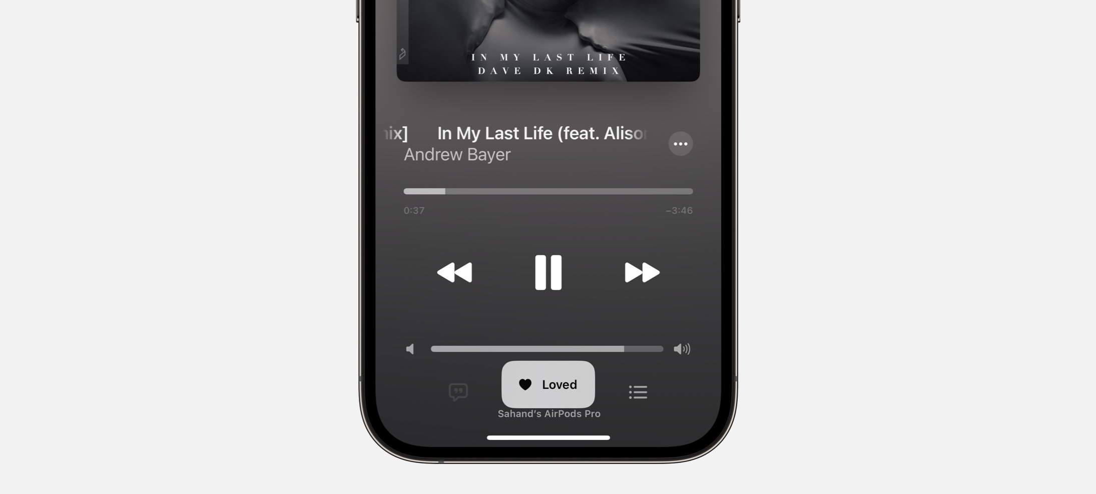
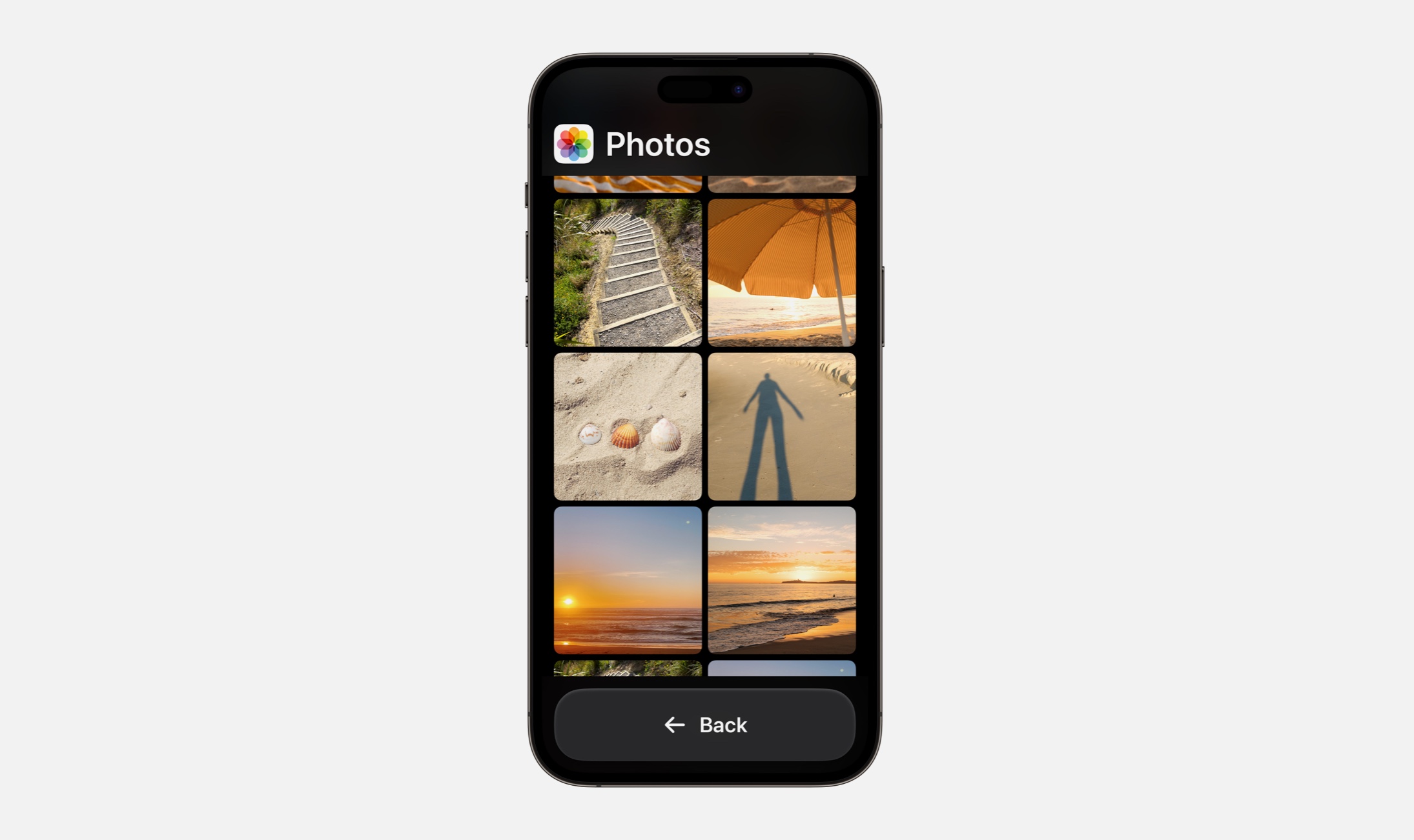
Today I’m excited to share a DetailsPro update that makes it easier than ever to make beautiful and detailed Apple designs. This new feature makes you faster when refining your designs and brings your content into the mix more directly than has been possible in any interface design tool before. Say hello to the new Repeat element.
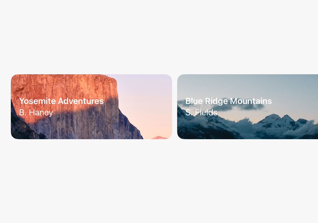
Repeat is made for the modern Apple designer in the very moment we find ourselves in all the time: designing a list of something (or a row of somethings). Whether a design calls for a carousel of cards or a triplet of tags, we often need to be able to design something, repeat it X times, and show different content in each repeated item. DetailsPro now supports this natively with an intuitive UI for creating these designs and goes even further and lets you customize each repeated SwiftUI item to make your next design beautiful, functional, and detailed.
Let me tell you just how Repeat works in DetailsPro and give you a quick tour.
Beautiful designs are made with Repeat
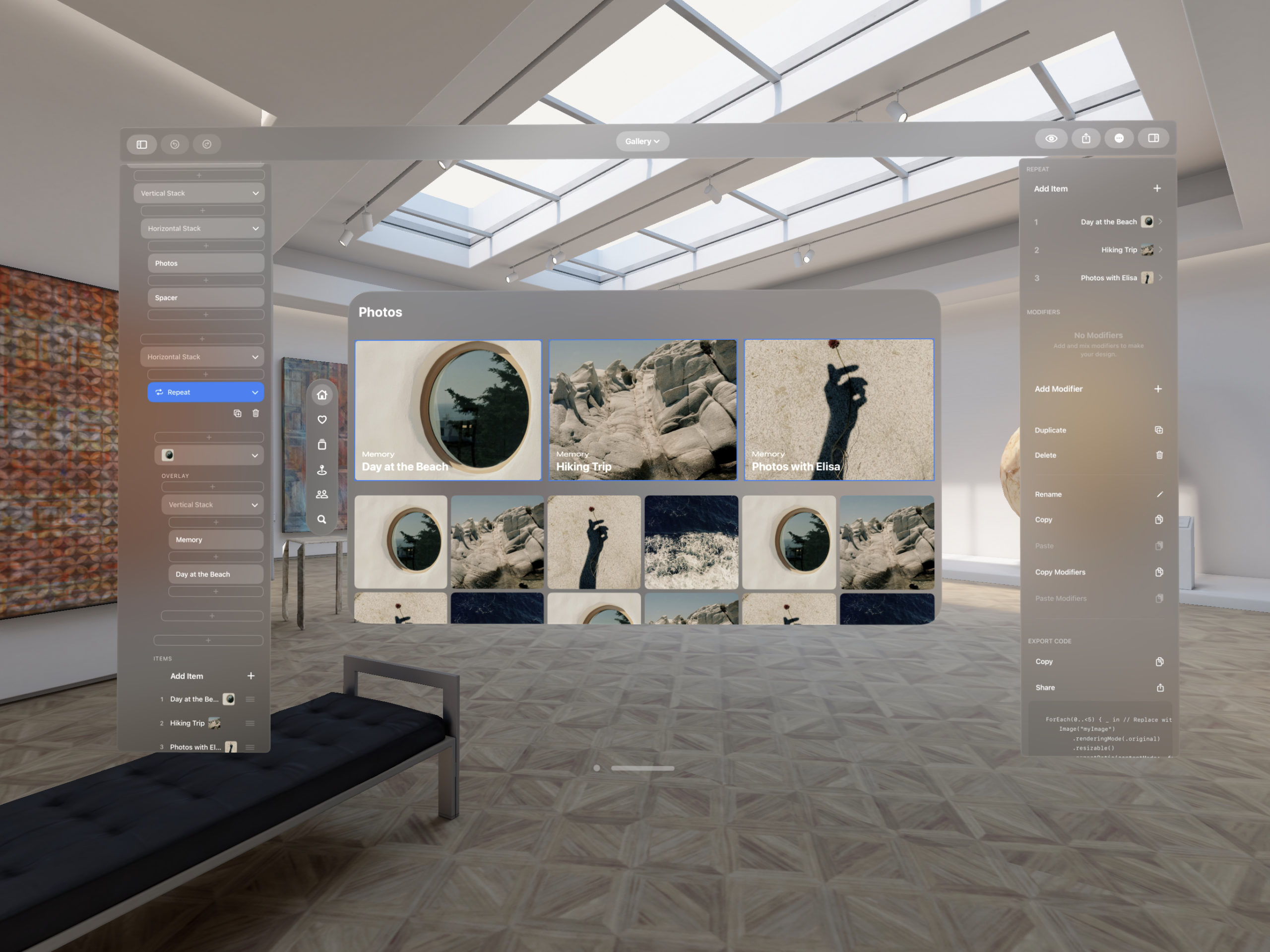
Repeat lets you take any element in your design and repeat it vertically, horizontally, or layered one on top of the other. The direction is determined by which kind of stack (Vertical, Horizontal, or Layered) you put on the outside of the Repeat. Your original element can then be repeated and you can quickly and easily change the content in each iteration of the repeat, all while the design changes stay in sync—any changes to the original element will immediately reflect in the repeats.
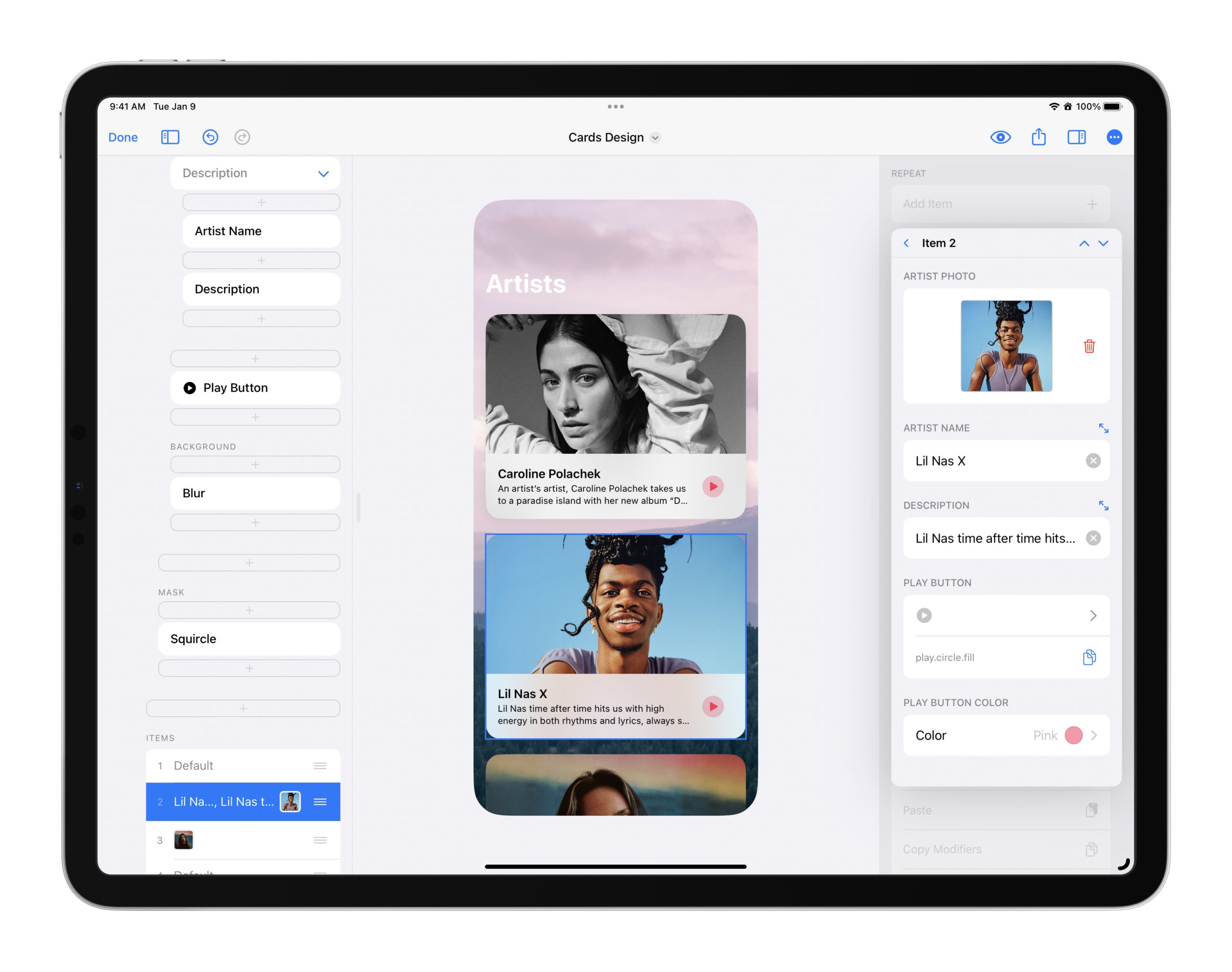
Now in your design process, you can focus on how each element should look and spend less time duplicating designs and making the repeat happen manually. Ever since I started working on repeating elements, I’ve started seeing them everywhere in Apple design, so I see this feature as something so essential to any designer’s toolbox.
How to make a Repeat
If you already have an element you want to repeat, you can long-press on that element and then select Repeat. This will make a new Repeat with that element and repeat it five times.
If you want to start a new Repeat, you can open the element picker just like with any other element and you will find two shortcuts for adding a Repeat: one that repeats items vertically and one that repeats items horizontally. The only difference here is which stack is used on the outside of the Repeat.
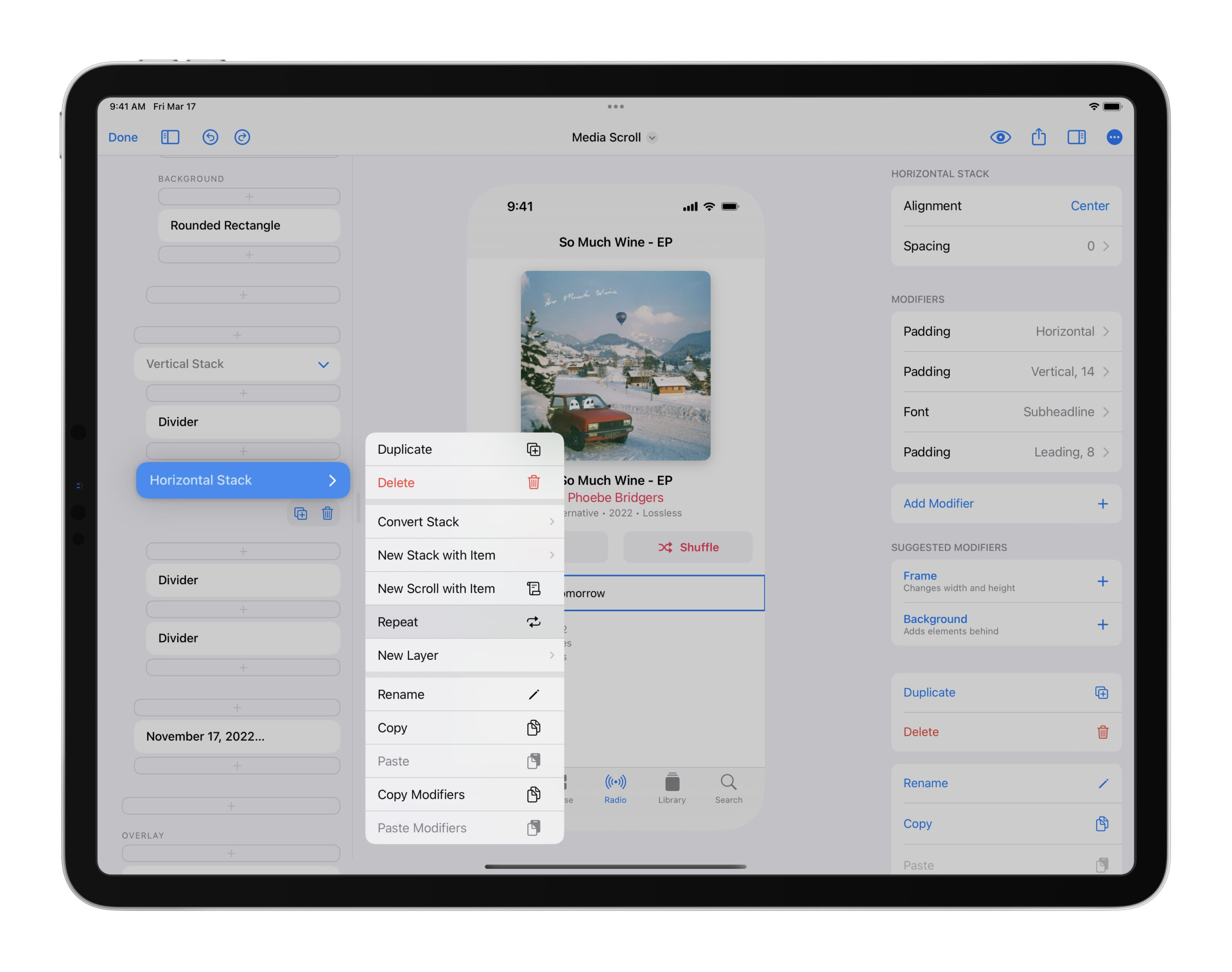
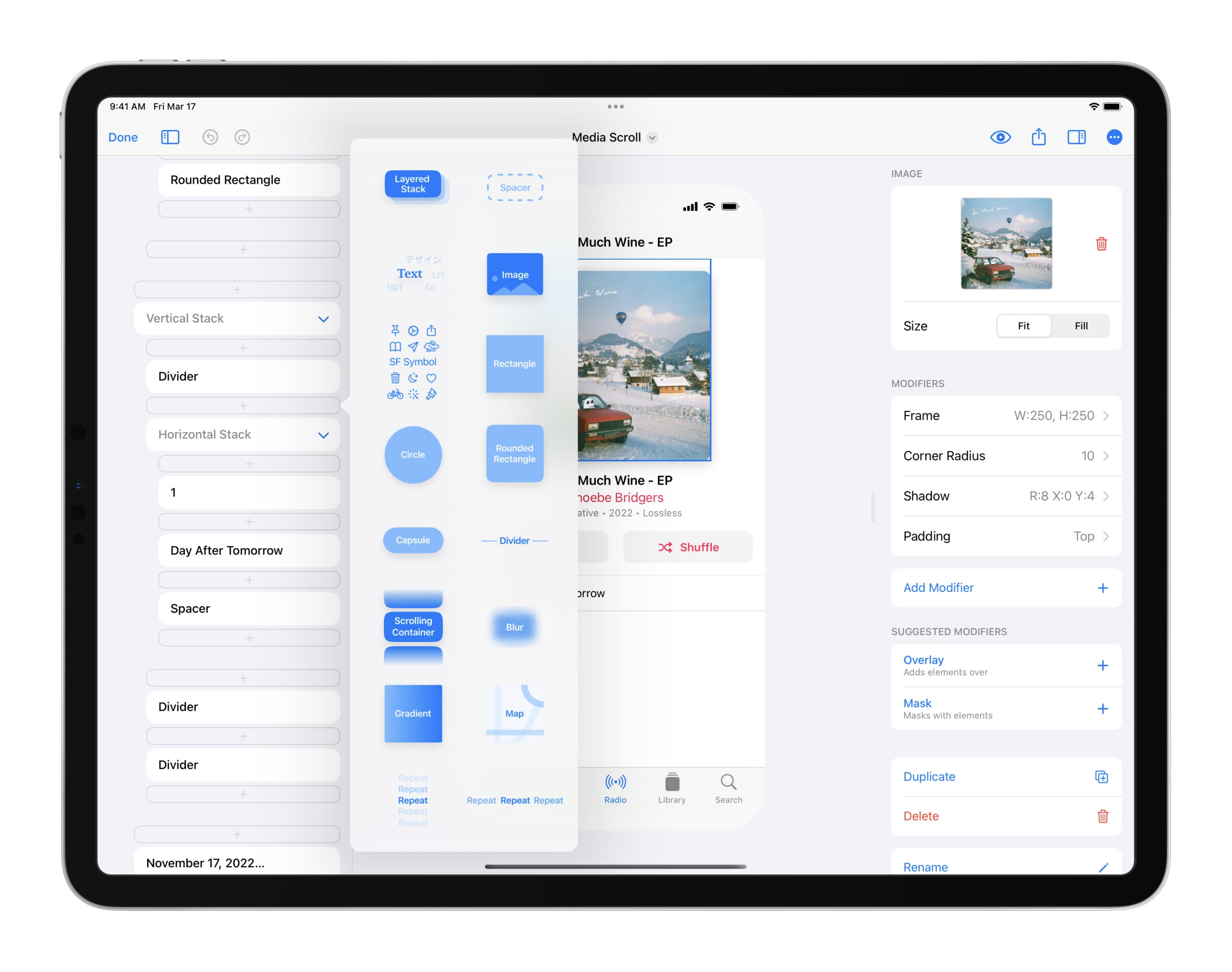
From there, any elements you put inside your Repeat will repeat. You’ll most likely want to use a stack as the first element and then create your repeating element inside that stack. If you are repeating rows, for example, you may want to start with a Horizontal Stack in your Repeat to arrange the inner elements of the row horizontally. You can also update the design of your element any time throughout the design process.
To add, edit, and delete iterations of your Repeat, you can edit a list called Items that appears. Every row in Items represents an item of your Repeat. You can swipe to delete an item or tap to edit it. Each row will also show you a preview of the content that has been changed for that item.
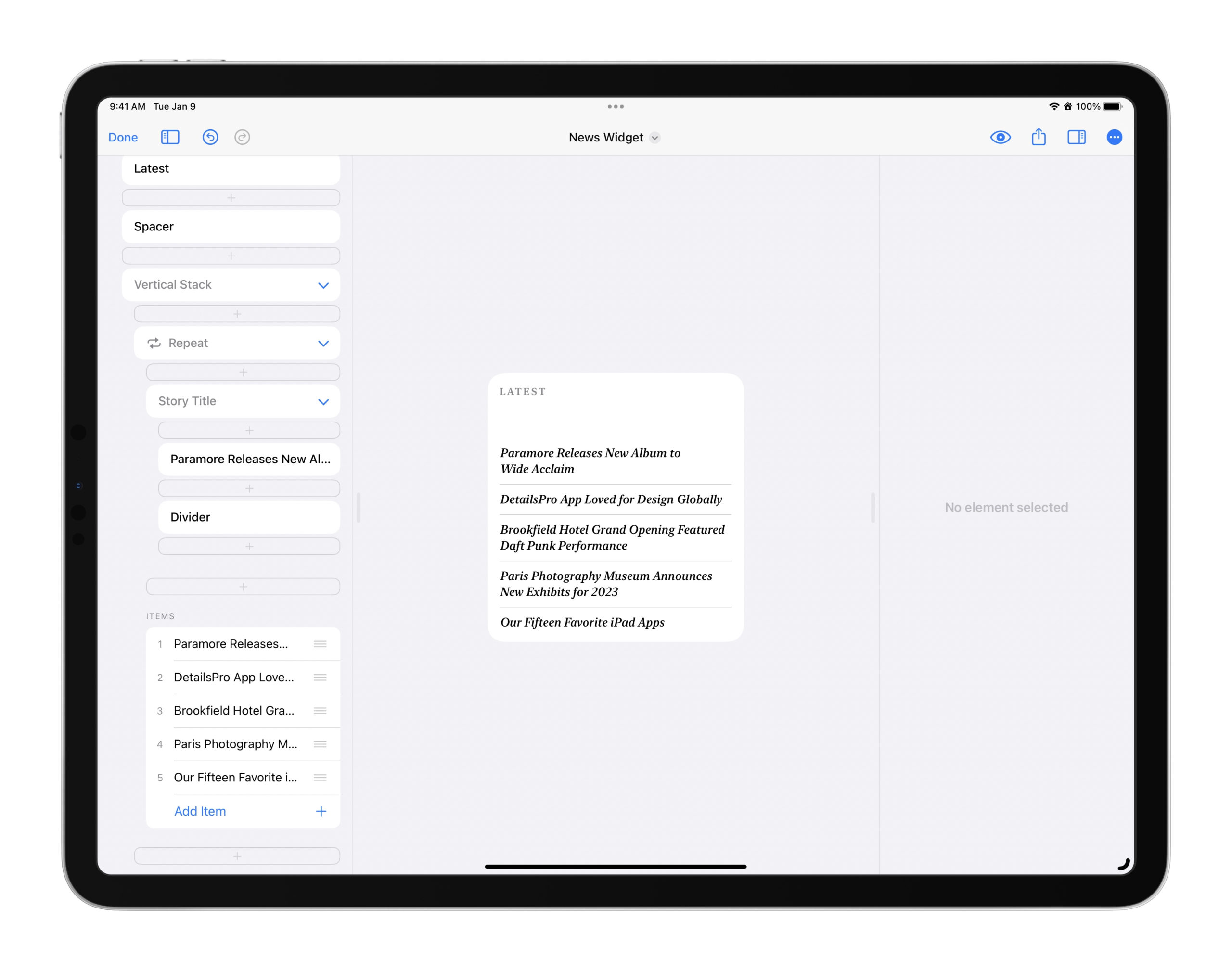
Repeats can have their own Repeats
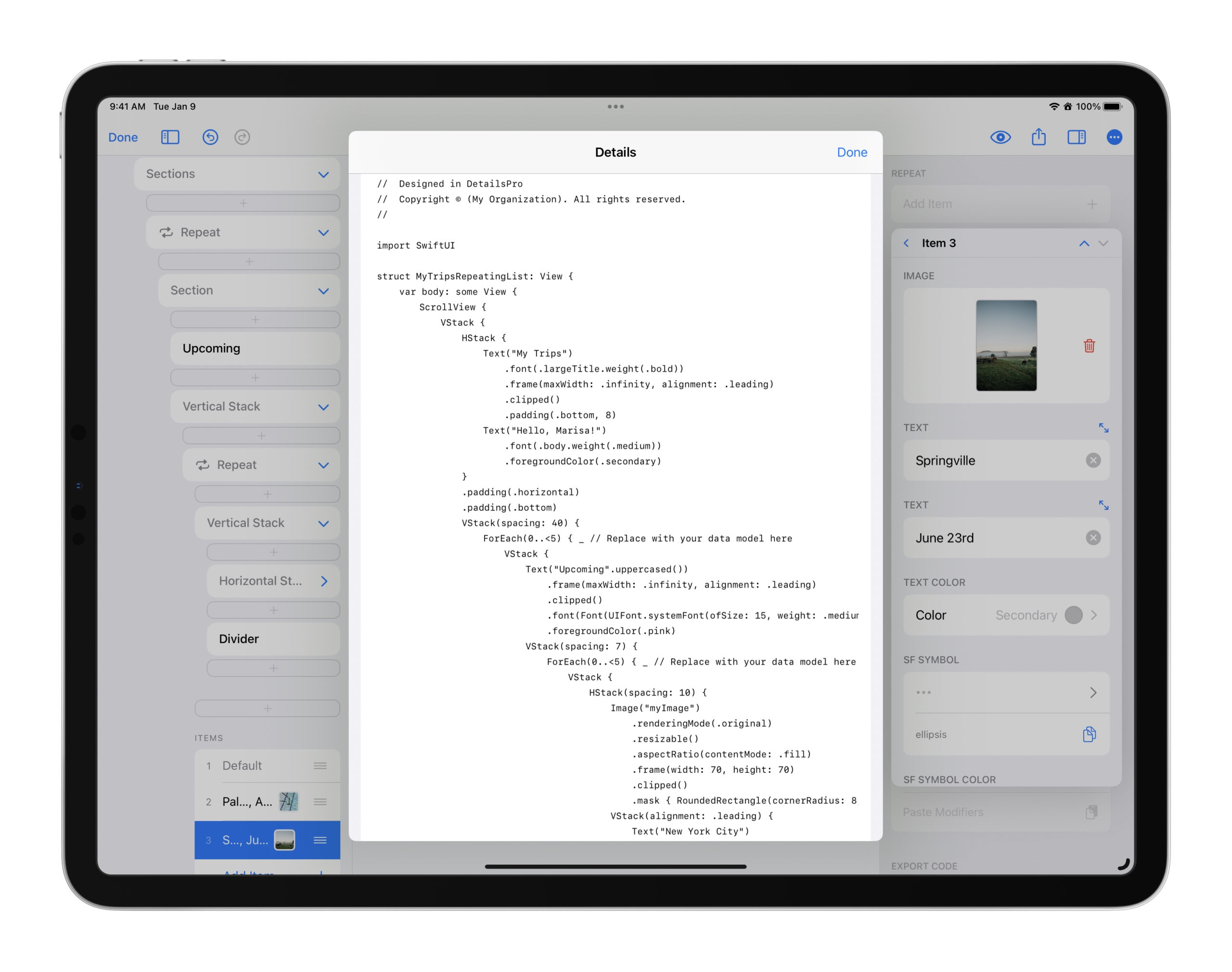
You can make a design that has a repeated element in it, like a list of trips that someone has recently been on where each trip has a row of in table, and then you can give that design a header and then repeat that whole thing. Everything still works in DetailsPro as you’d imagine: you have only one source of truth for what a trip row looks like and when you update the original, all the repeats will update too. And yet! In each repeated section of trips, you can customize and change the number and content of the trip rows inside! One section could have three trips, another five, another ten, and so on.
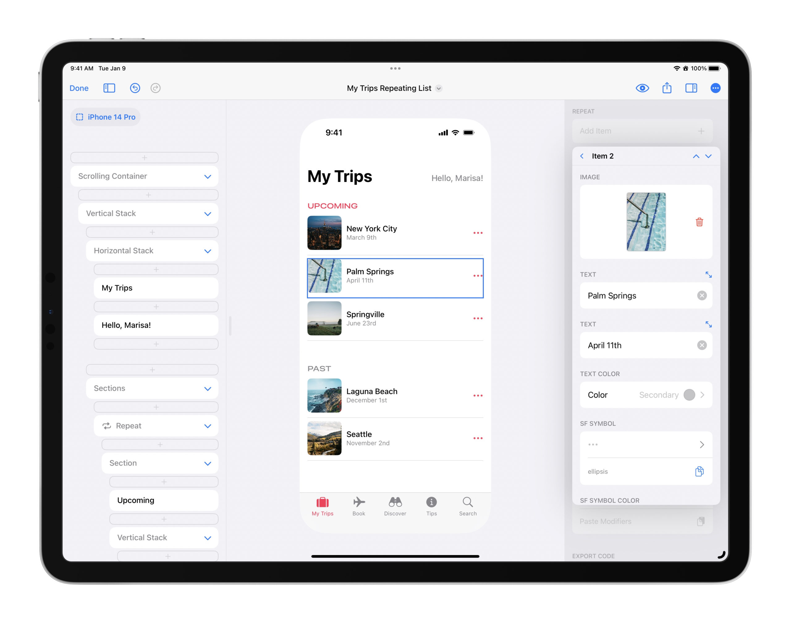
Supporting nested repeats was absolutely necessary to making sure this feature was ready for designers because one of the most common Apple designs can be seen in popular apps like Apple Music, the App Store, Photos, and others: a vertical scroll of horizontally-scrolling rows. And now, you can make designs just like this quickly and easily.
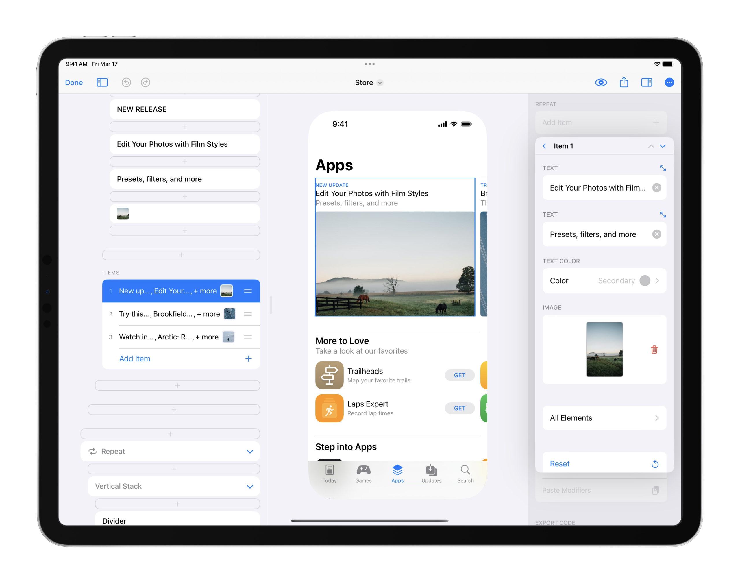
One of the built-in templates, Store, demonstrates this type of design. Start a new design with it as the template to get a good starting point to go off on your own!
Tips & Tricks
Here are two tips that will you get going with Repeat with a great head start.

- You can make the Repeat item inspectors friendlier to read by naming your elements. The fields in the Repeat item inspectors use the element’s name as their field name, so if you name your text element as “Title” or “Artist Name”, for example, that text will appear instead of simply “Text”.
- You can use arrows to jump quickly from one item in a repeat to the next. The arrows are in the upper right-hand corner of the repeat item inspector and you can see them in the above image.
- Tap on the All Elements button at the bottom of every Repeat item inspector to access a list of every element that is in the design of the repeat. For that item (say, the second item in the repeat), you can choose to toggle on or off any element within that design. You can use this feature to hide design elements that don’t need to be on every item. For example, you could design a “Featured” banner and put that only above the first element.
- Tap on any element within the All Elements section to edit any of the options for that kind of element and edit the modifiers on that particular element. Any edits made here are only made to this repeat item, so you can use this to make changes like changing the font or adding extra padding just on one item. This section was designed for those rare occasions where you might need these options, but I expect that in most design sessions you won’t need to use anything in here.
Code Export
Your Repeat element will export to SwiftUI code as a ForEach and will export your original element inside the Repeat. From there, you can update the code to use string variables, color variables, in more in Xcode or Swift Playgrounds.
Philosophy behind this update
To explain a little bit about how this feature came to be and why I designed it to work this way, I can share with you the biggest thing that was top of mind for me: repeats are everywhere. I just came to think that this design pattern of something-that-repeats-but-just-the-content-changes is so common, especially in Apple design where we have so many standard apps that have taught us how to design lists, carousels, and so on that I wanted to make something specifically for this task.
DetailsPro’s purpose is to be a design tool for anyone who is designing software for an Apple product. They don’t need to know how to code, they don’t need to know how to design, they just need to know how to use an iOS-style app. That is what drives everything when I’m working on a new feature and wondering how it should feel and behave.
So these two ideas basically came together and I was led to: I need to make a feature that is made for handling repeating designs, and it needs to fit into DetailsPro in the DetailsPro way. (The DetailsPro way, by the way, is something that I get both a lot of good feedback on and a lot of bad feedback on. Many people want to be using what is essentially a full Xcode for iPad, which is not what I am able to offer or even going for. I’m going for what is essentially a live notebook, purpose-built for SwiftUI design, that is so easy and fast to use that a designer in a meeting can pull their iPad out and make something new on the spot to show to colleagues before the meeting has even ended.)
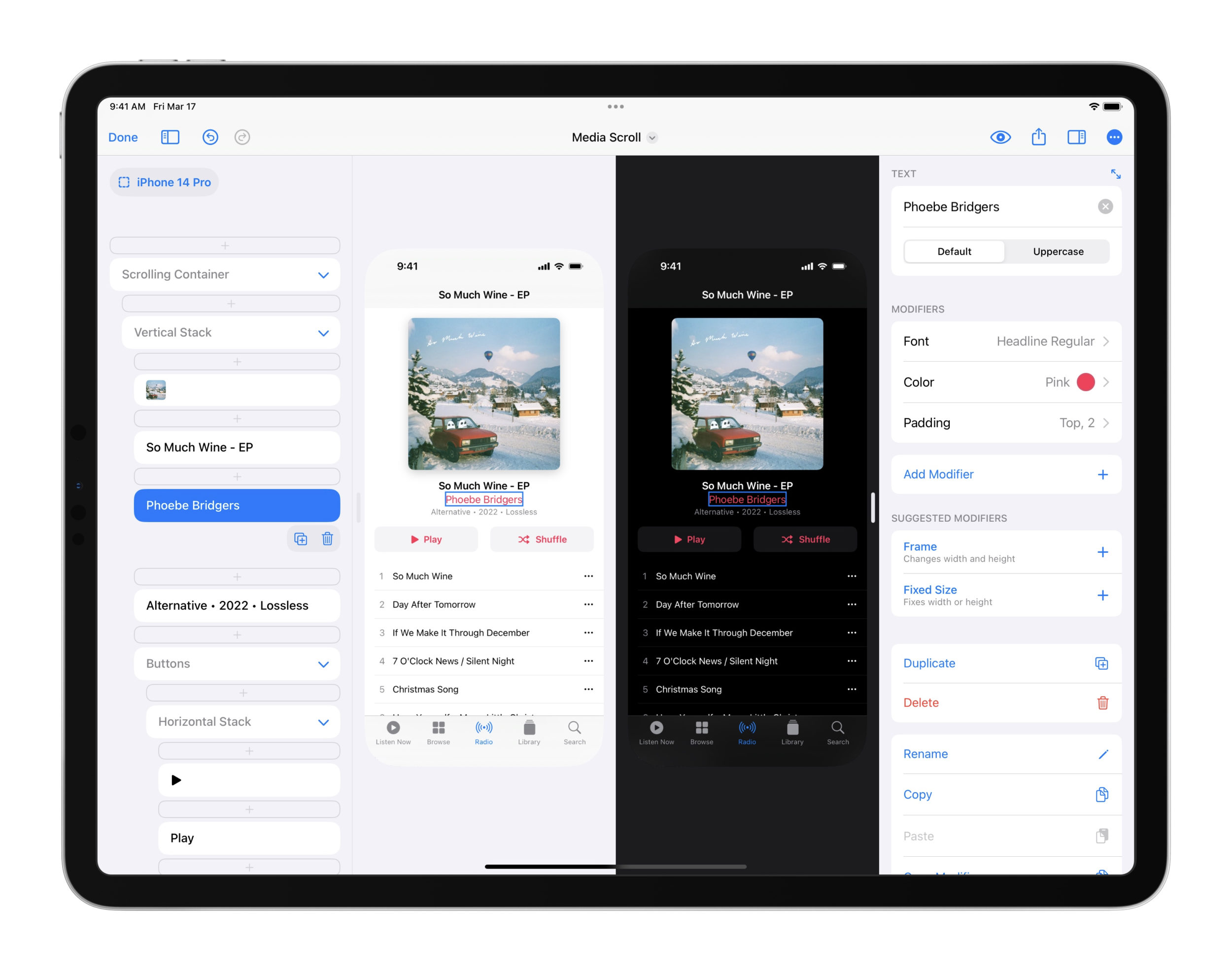
The desire to make something that was made for repeat is what led to what I think is the coolest thing about this feature: all the repeating elements are stuck together in essentially a group, held together by the repeat. Today, I find this to be so essential and a “no-brainer” but it was only one of many, many designs I considered along the way.
The other major component was how to handle the variation between items in a repeat. While changing the text and the images between elements is essential and very easily understood, it took me a lot longer to figure out how to support the situation where you want to have an item in the repeat be very different from an item before it (maybe you want it to have an element none of the other items have, or you want it to have five more elements in a nested repeat than the others). I’m in love with the way this works in this new update, where from item-to-item you can remove or include elements within the main element, changing modifiers and changing nested repeats. But it took a long time to get to this.
So I hope the way this feature works is something that you find both easy and enjoyable to use. It was made specifically for any attached, repeating set of design elements. It was made with the modern Apple designer in mind, the one who maybe sort of understands the general idea of how code works or SwiftUI works, but thinks more in terms of fonts, spacings, colors, and layouts than they do in anything else.
Just the Beginning
I’m really excited to be sharing this update with you today, which is available for all DetailsPro designers, and I can’t wait to be back to share the next improvement that is coming to DetailsPro related to repeat… grid! Just the same way that I’ve been waiting for so long to be able to offer this necessary functionality, I’ll have something to announce for grids very soon now that we have Repeat as a foundation.
Thank you as always for keeping up with DetailsPro and for all of your support. If you have any requests or questions about Repeat, feel free to contact us.
 Sahand Nayebaziz
