WWDC22 kicked off today and wow. Apple Design was everywhere and every part of Apple Design felt more expressive.
Overall, this was definitely iOS 16. We are not in iOS 15 anymore. The design is moving ahead, it’s getting deeper, it’s branching out, and overall I think it was a huge year for design.
Below, my first impressions of what I remembered most on day one of WWDC22.
Table of Contents
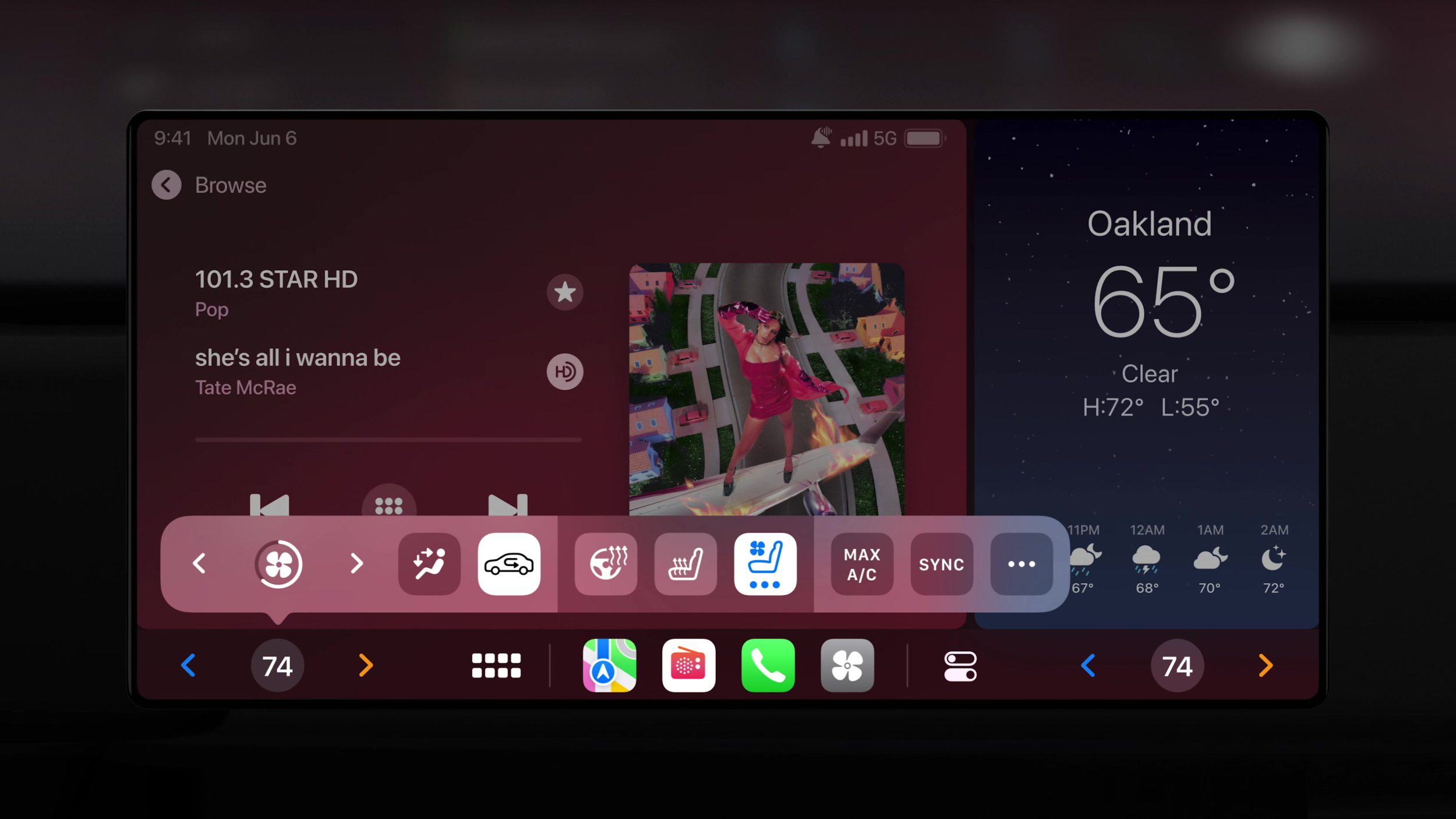
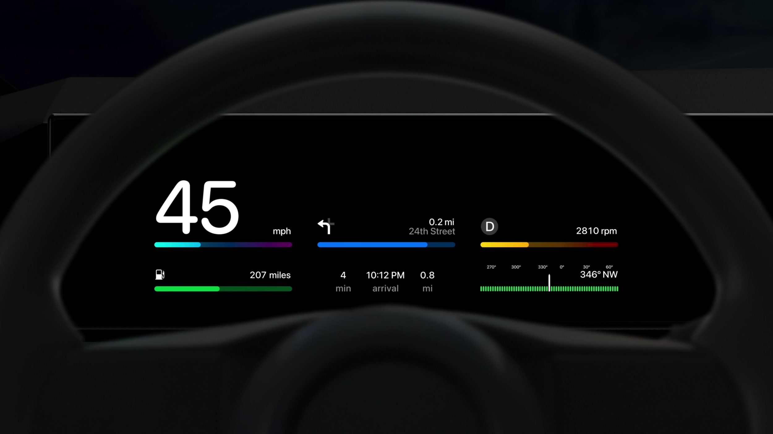
That CarPlay Footage
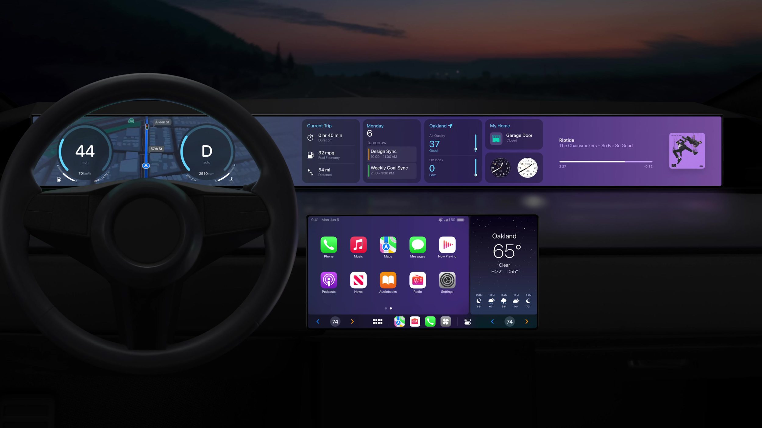
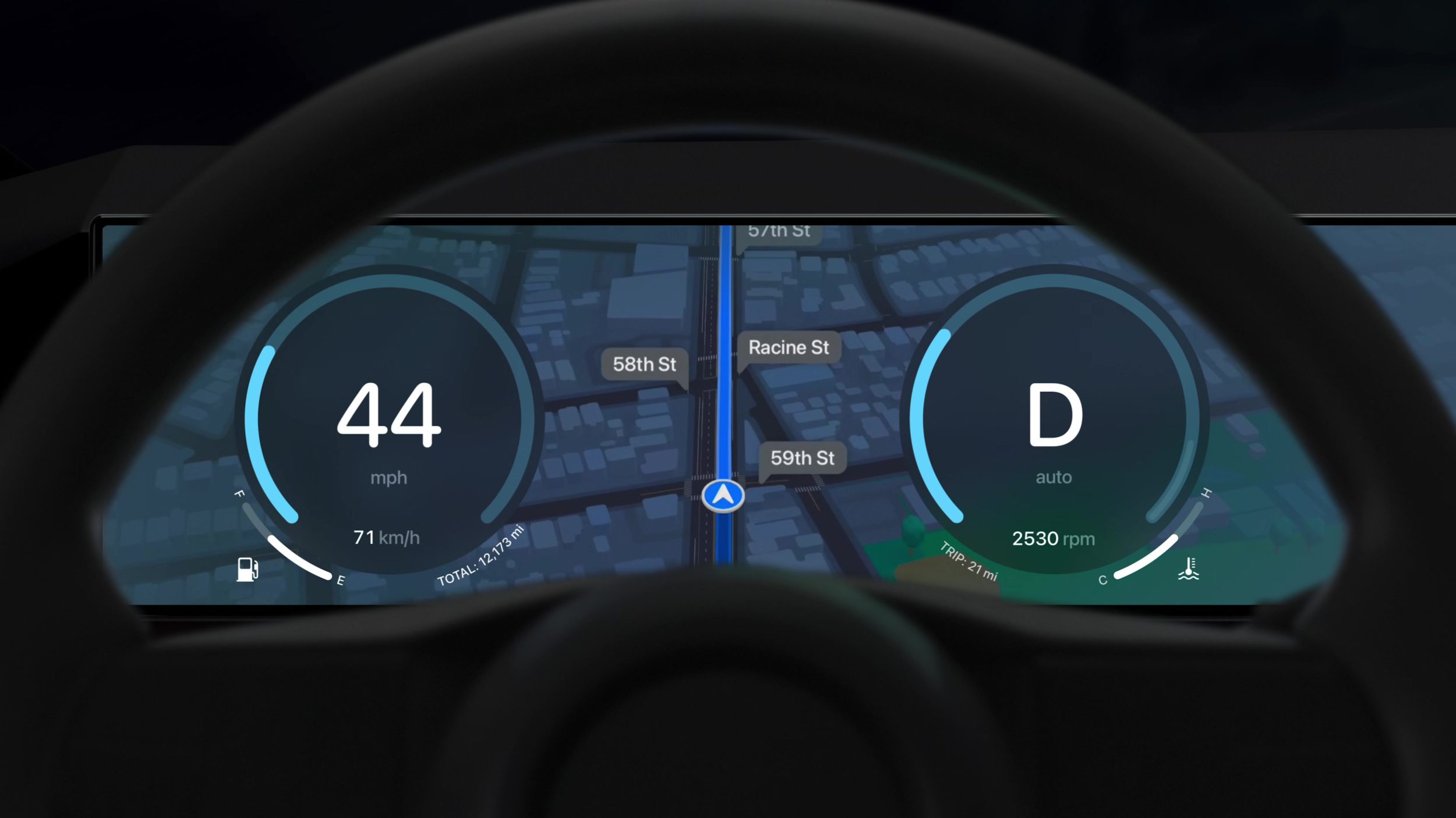
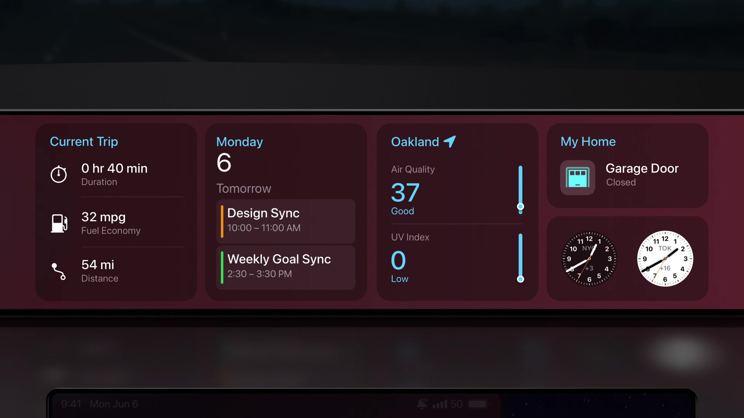
I felt like I was dreaming at this point. I still can’t believe we got to see this much footage of future CarPlay designs, and all of it was moving. These designs looked beautiful, clear, and familiar but I really need to watch more to start to understand what’s happening.
Lock Screen
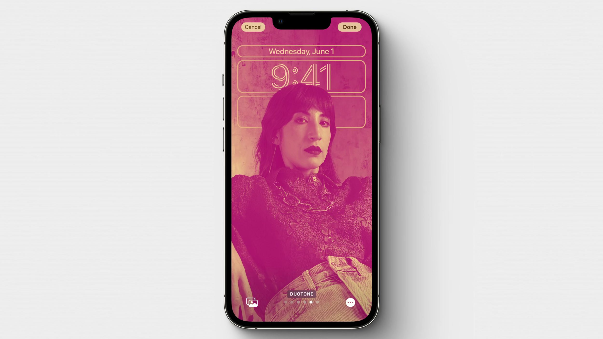
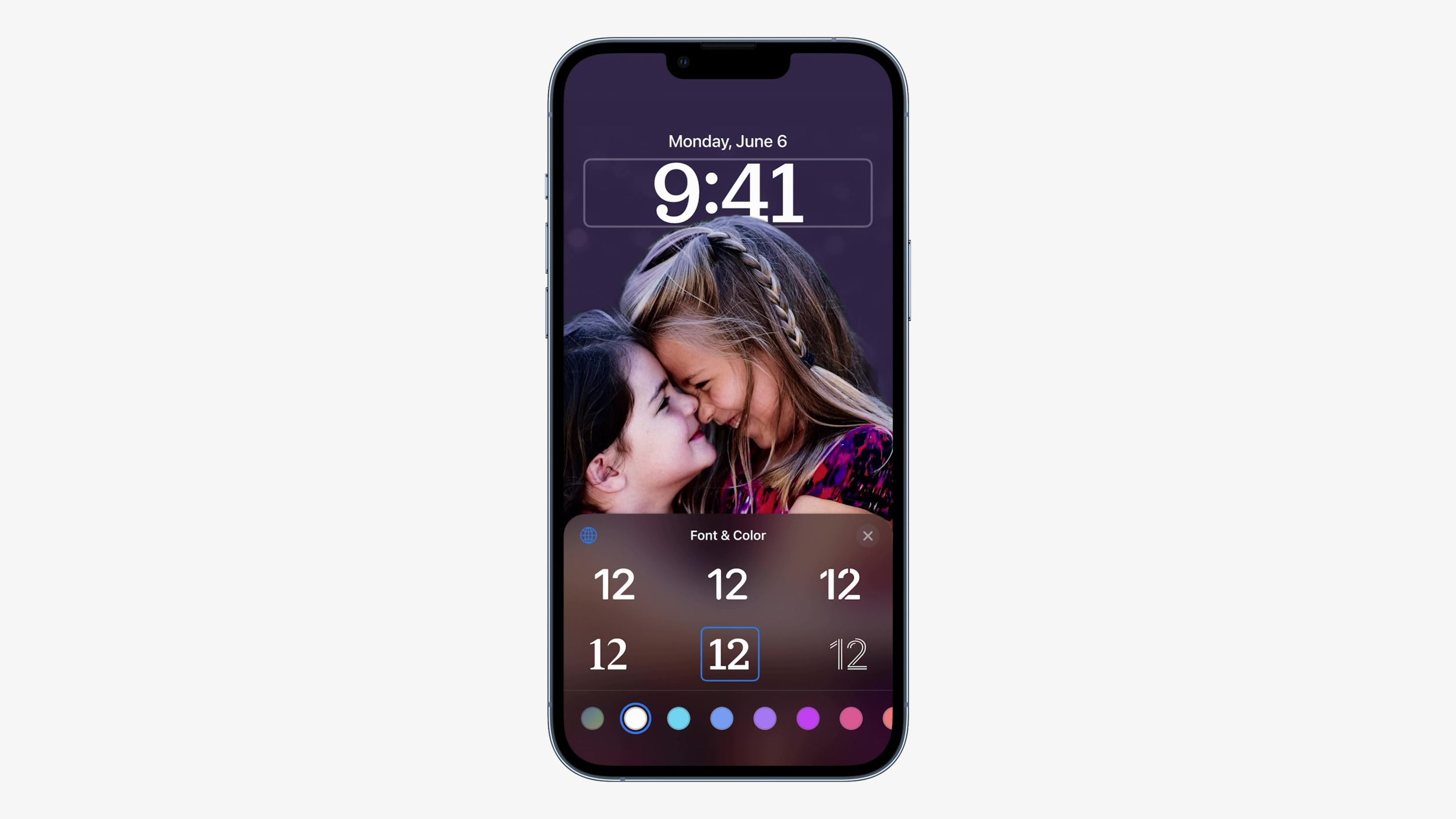
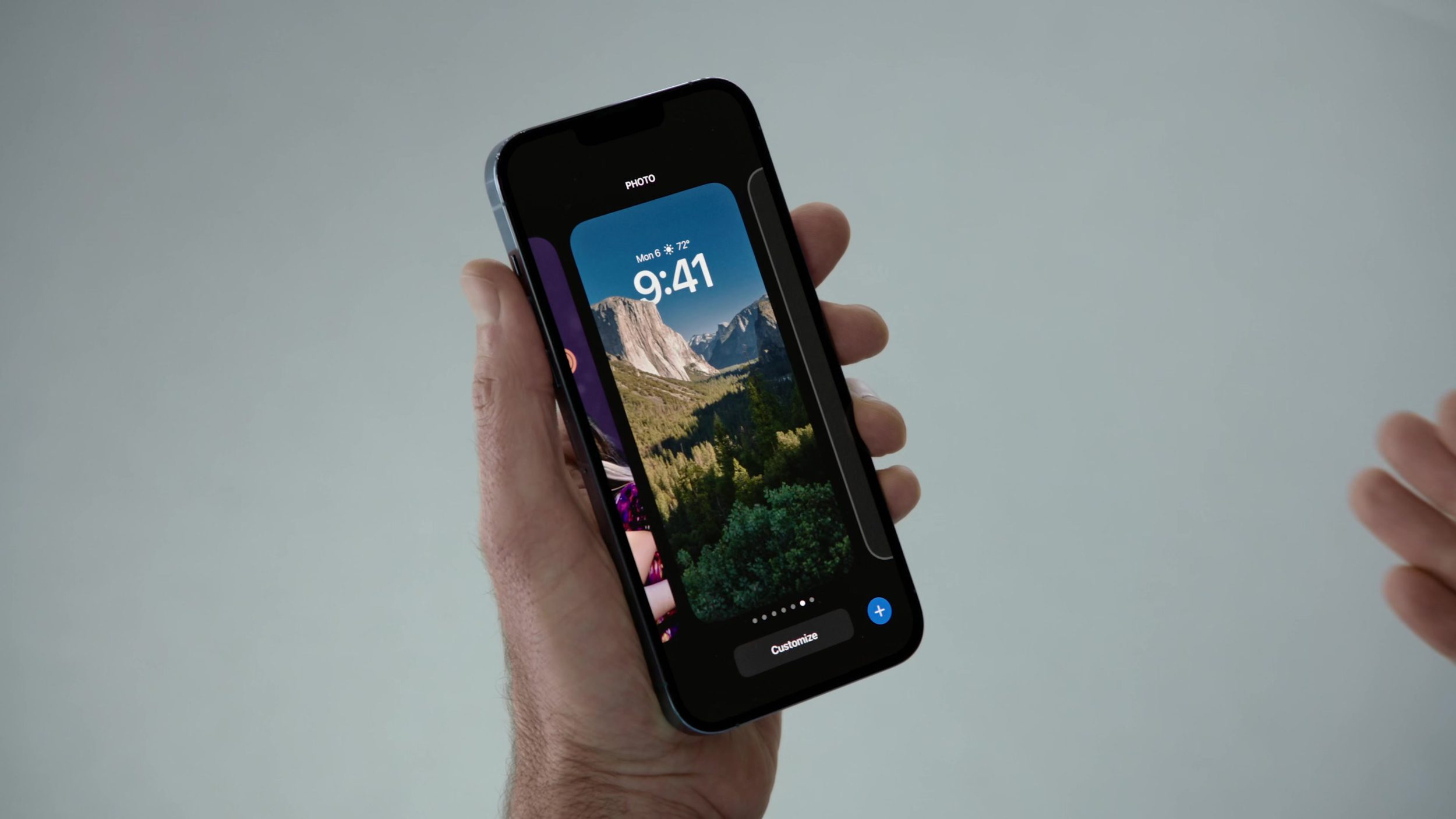
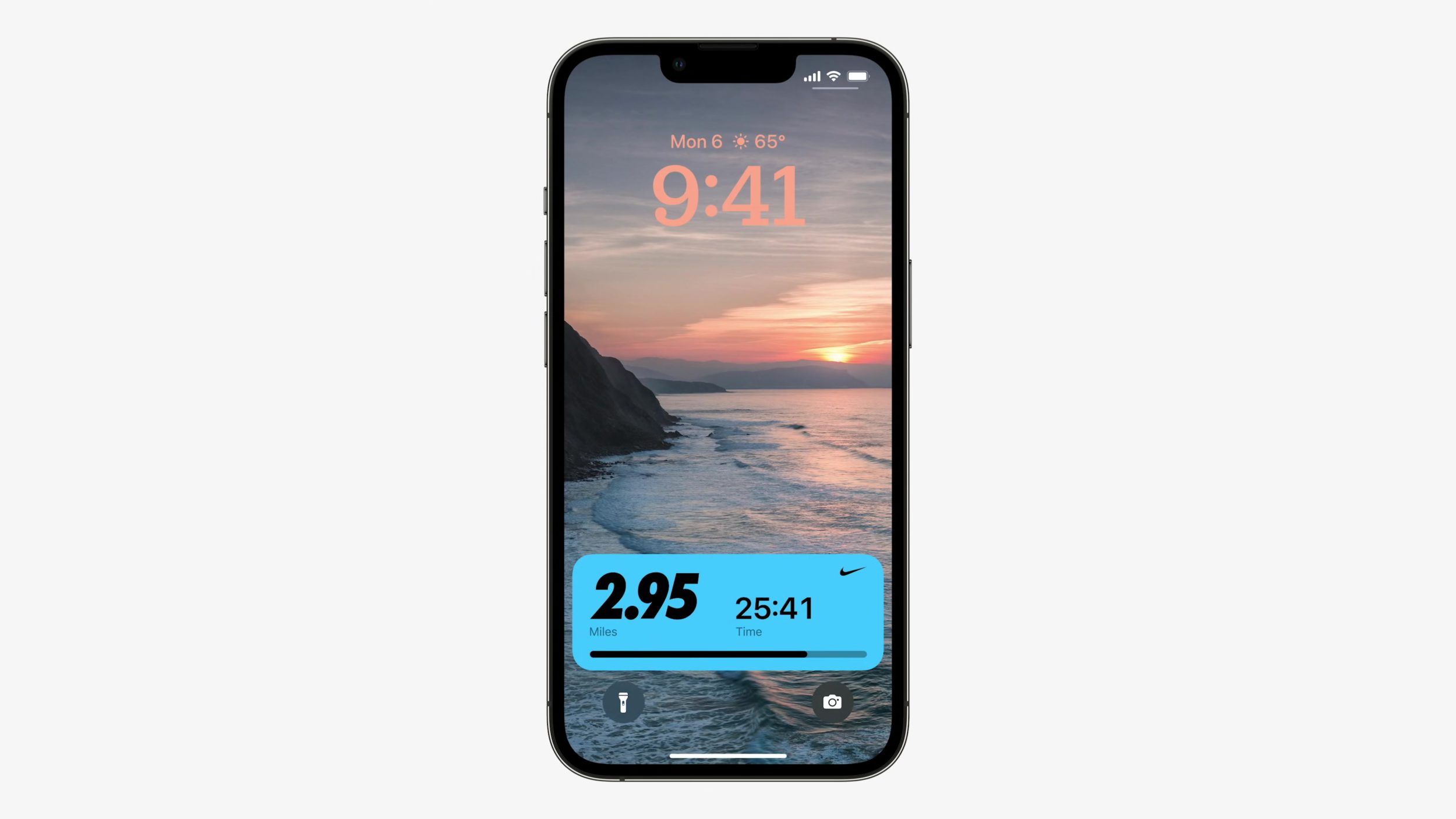
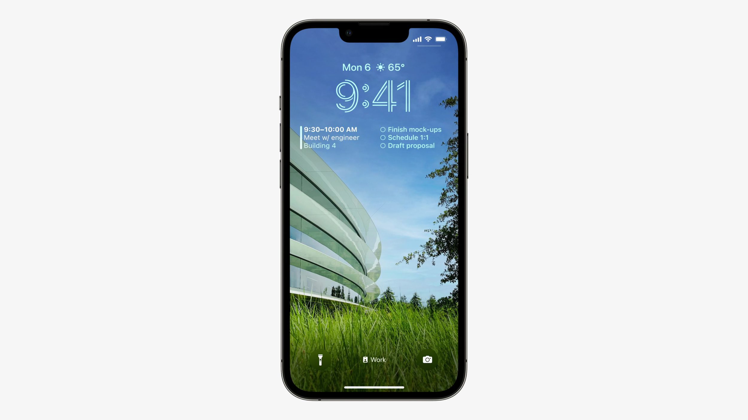
Being able to customize the Lock Screen, not only from the fonts and the layered wallpaper that puts the time behind elements of your photo, but also to be able to add widgets in any order. This was all amazing. First impressions: Apple style abound, looks super easy to use, and really fun.
Stage Manager
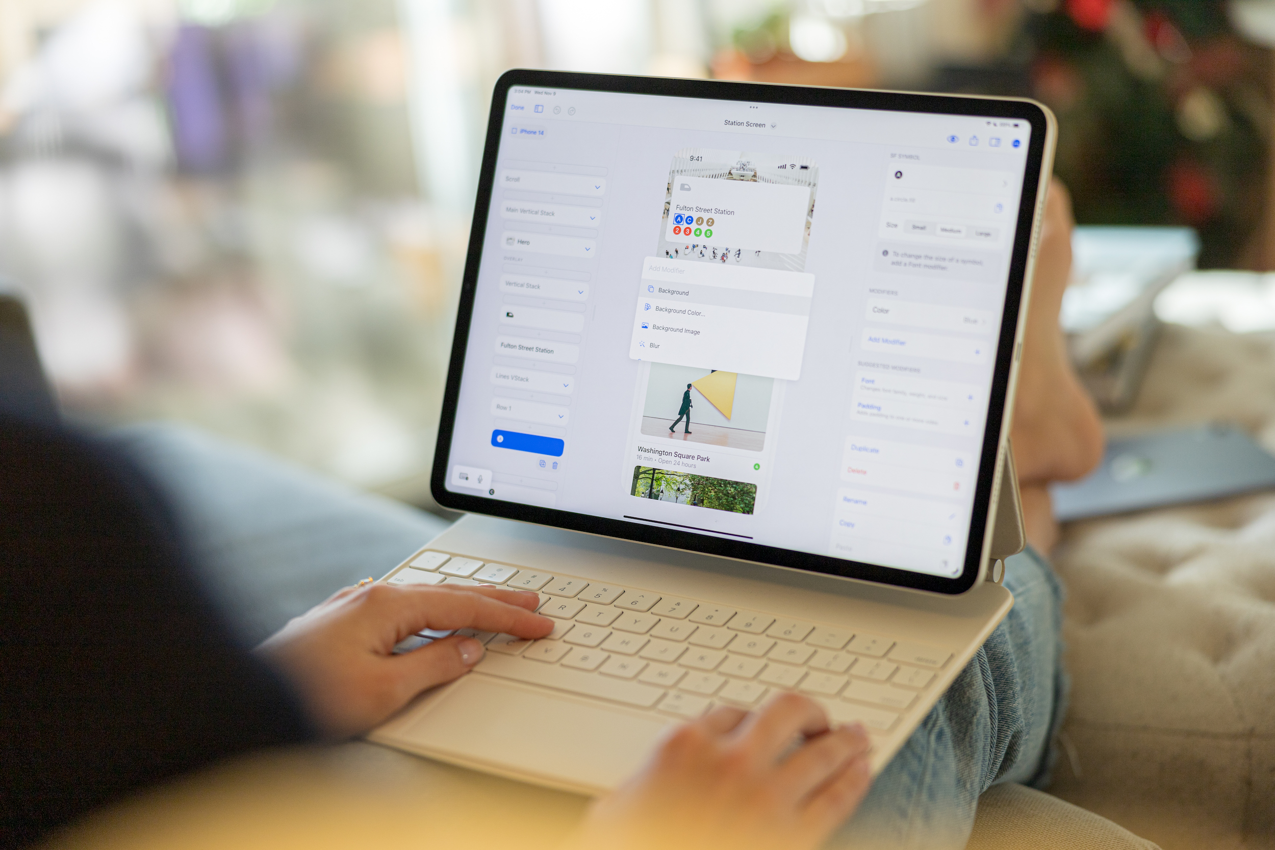
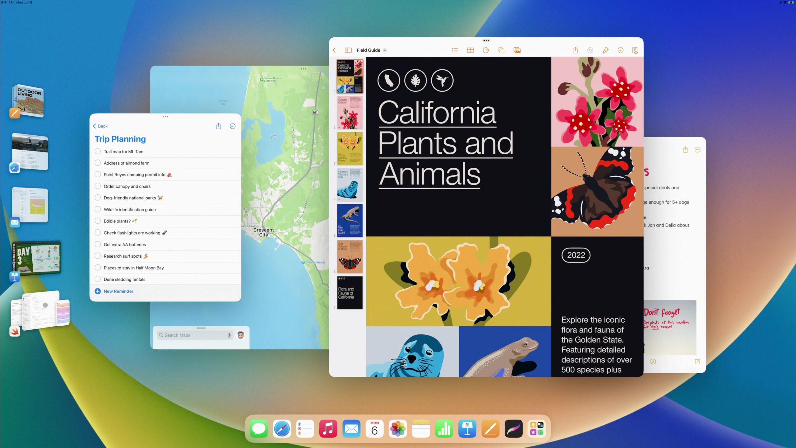
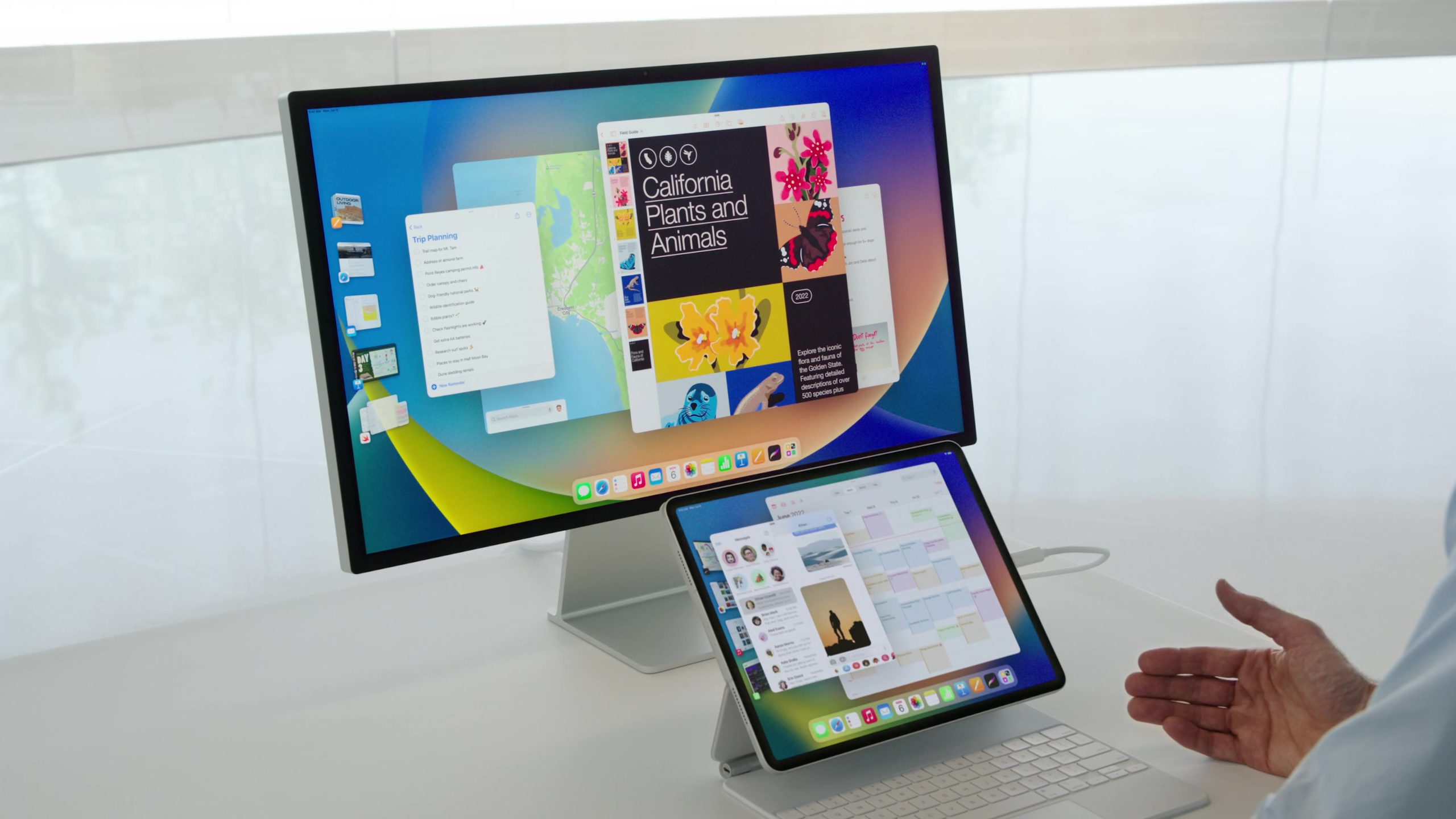
This was the other big thing and oh my is it amazing. Stage Manager feels like the futuristic window management that we’ve always imagined could be possible, and here it is for real. This just looked like it was the answer to better window management, and it’s beautiful to look at. I am really excited about this and already from using it on my iPad, I’ve had a great time with it.
Colors
Just another look at the colors here. The colors around iOS 16 felt great to me and matched everything that was happening around this logo—the blending, the expression, the growth.

And that’s just the beginning
I am so excited to dive into more this WWDC22 week and to learn more about the designs of the other features I didn’t mention here that still looked amazing, like Freeform, macOS Ventura, new iPadOS Desktop-Class apps, etc.
Stay tuned to the DetailsPro blog and Twitter for the next articles! Have a great WWDC22!
 Sahand Nayebaziz