 Sahand Nayebaziz
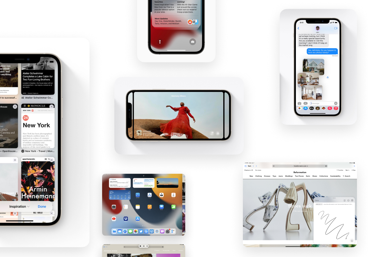
Apple debuted new operating systems and applications at the 2021 Worldwide Developers Conference (WWDC) and included in all of the new updates were many new design updates and changes. From SharePlay to new designs in Messages, there was something for everyone. Here’s a list of our favorites.
1. New design for pictures in messages
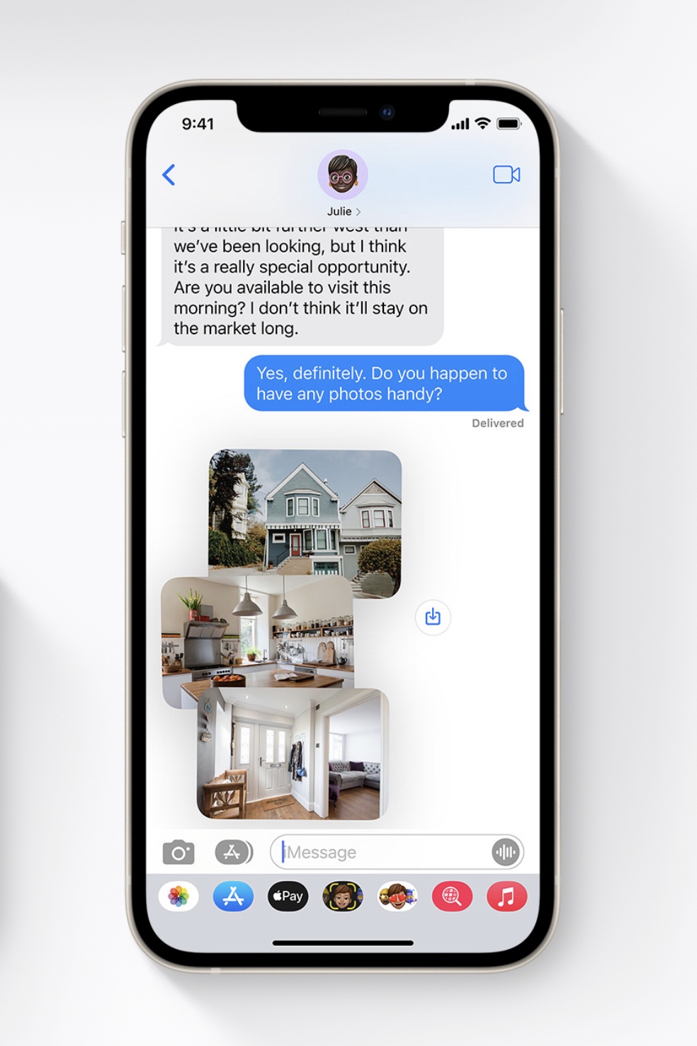
Apple debuted a brand-new design that kicks in when you send multiple photos in Messages. If you send a few, you see them tossed together in an airy stack (pictured above) and if you send more than a few, you see them collected together in a neat stack. This vibrant new design also works with an interactive swiping gesture that lets you flick through the different images easily. Bonus: sending a bunch of photos no longer takes up a ton of space in the conversation.
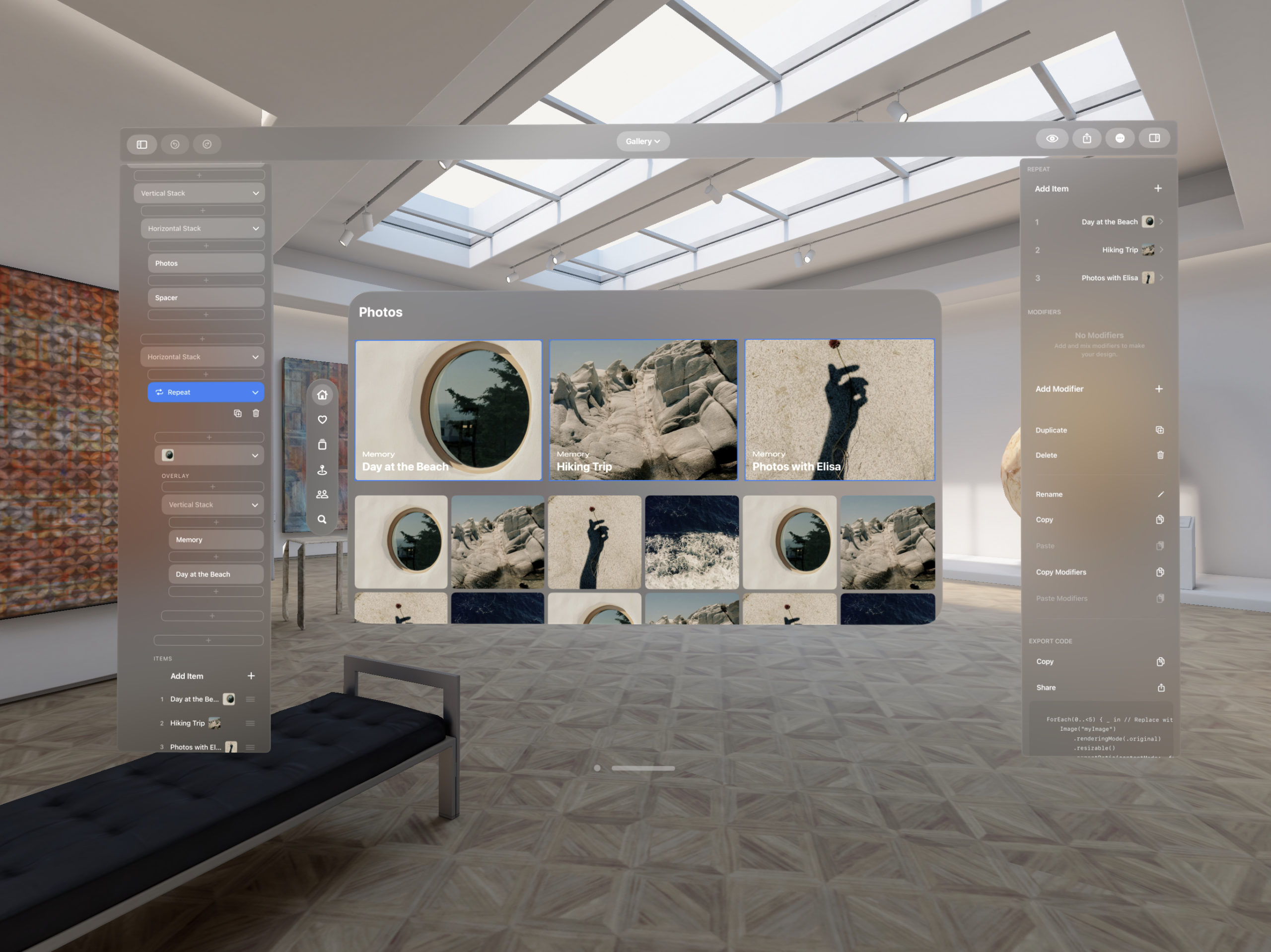
2. An amazing look for new Photos ”Memory Mixes”
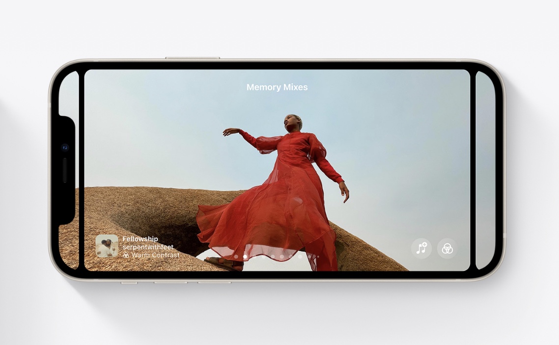
Apple shared a new feature for Photos called ”Memory Mixes” that mixes music you’ve been listening to with photos that you’ve taken. You can take a look back at a weekend you spent listening to the Bee Gees, or a birthday night you spent playing Polo & Pan. This design is definitely one of the more sophisticated and elegant ones that we’ve seen, with it’s parallax-like sliding effects and neatly overlaid text.
3. An all-new Safari toolbar design
Apple debuted an exciting and polarizing new look for Safari: the address bar has moved entirely to the bottom and now floats over the content of the page. We are loving this new look because it makes the address bar so much easier to reach as opposed to being all the way up at the top.
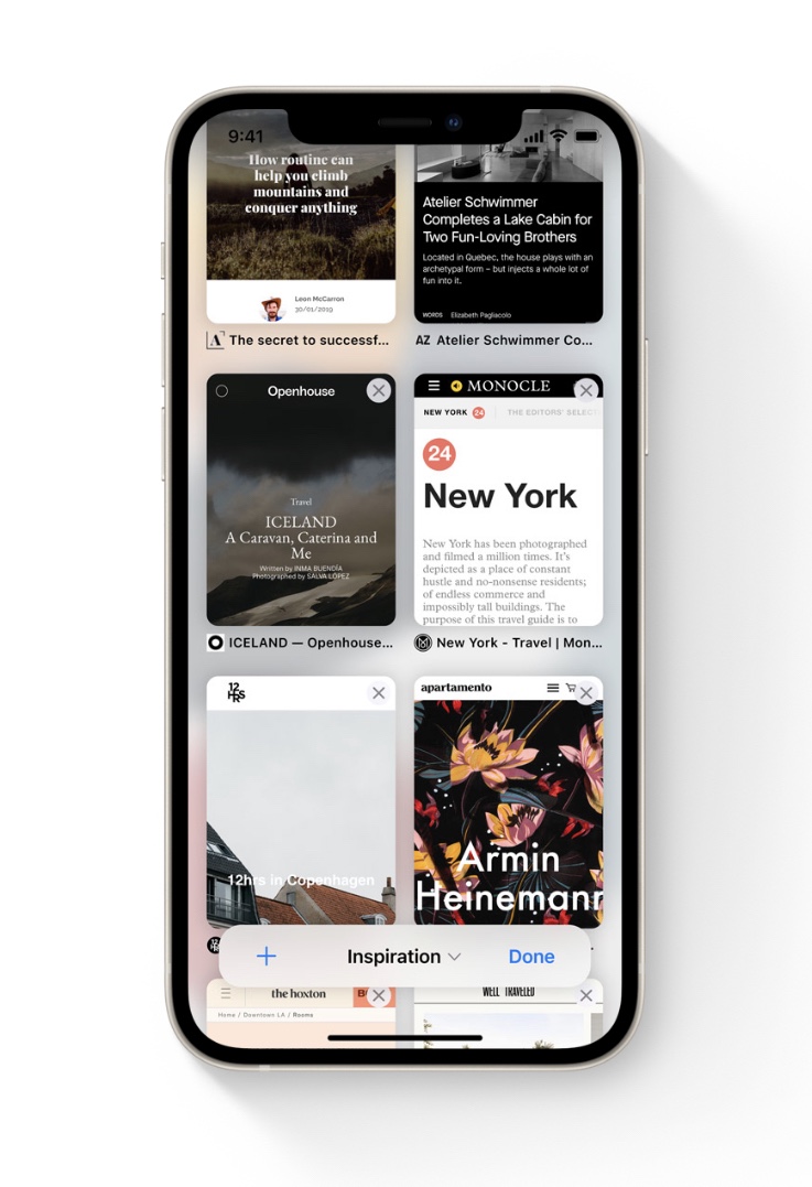
4. A new note-taking UI called ”Quick Note”
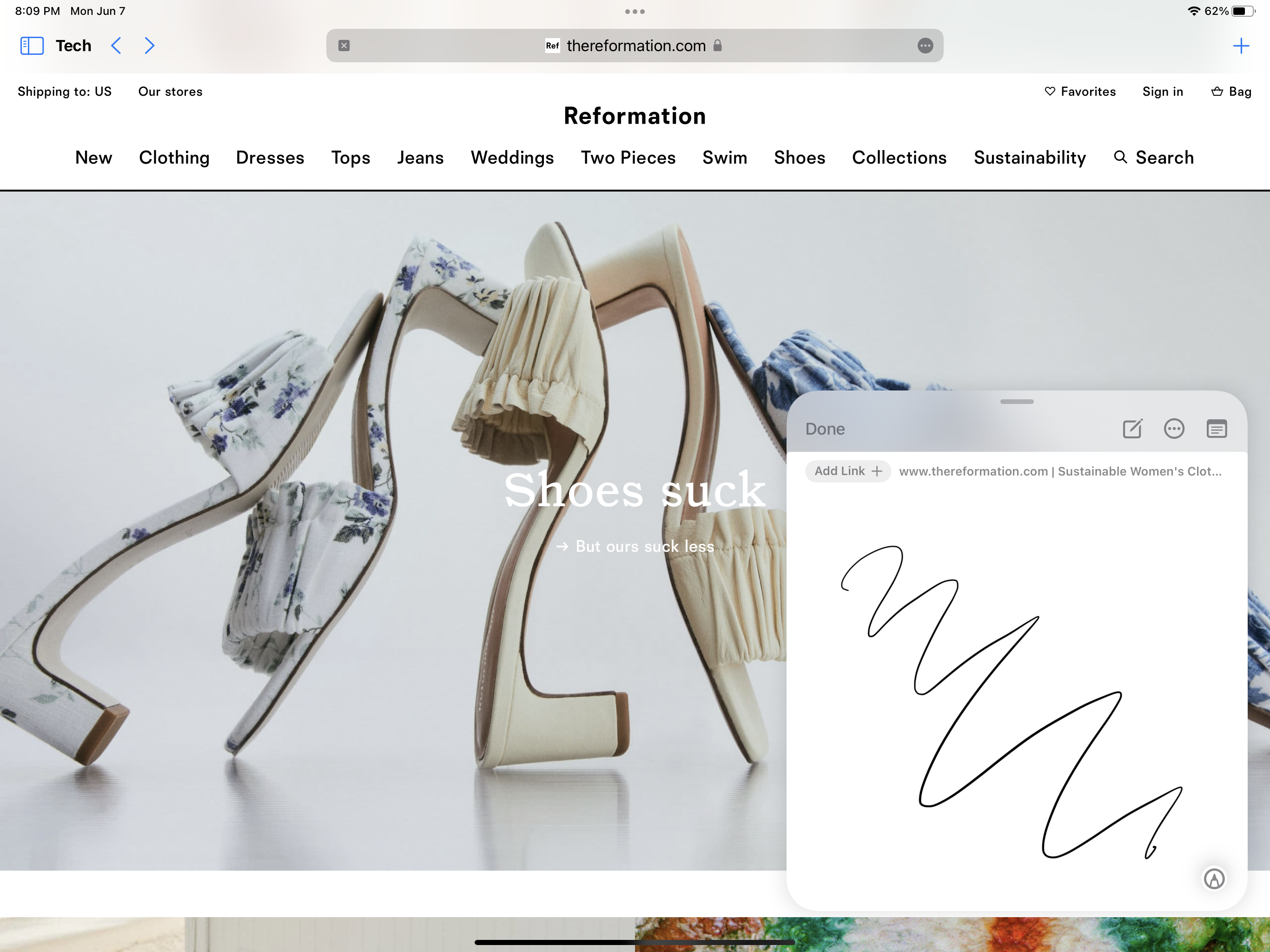
Apple debuted a new utility that looks great on the iPad called Quick Note, and it works by interacting with the bottom right screen edge of your device to pull up a new blank note. What’s more, Quick Note can store links, images, and even knows the context of what app you were in, whether it’s a page in Safari or an item in a 3rd party app. With that context, Quick Note can save the place you were in an let you come back. This is another light and feathery interface that features a compact toolbar, extremely high levels of interactivity, and beautiful Apple clarity.
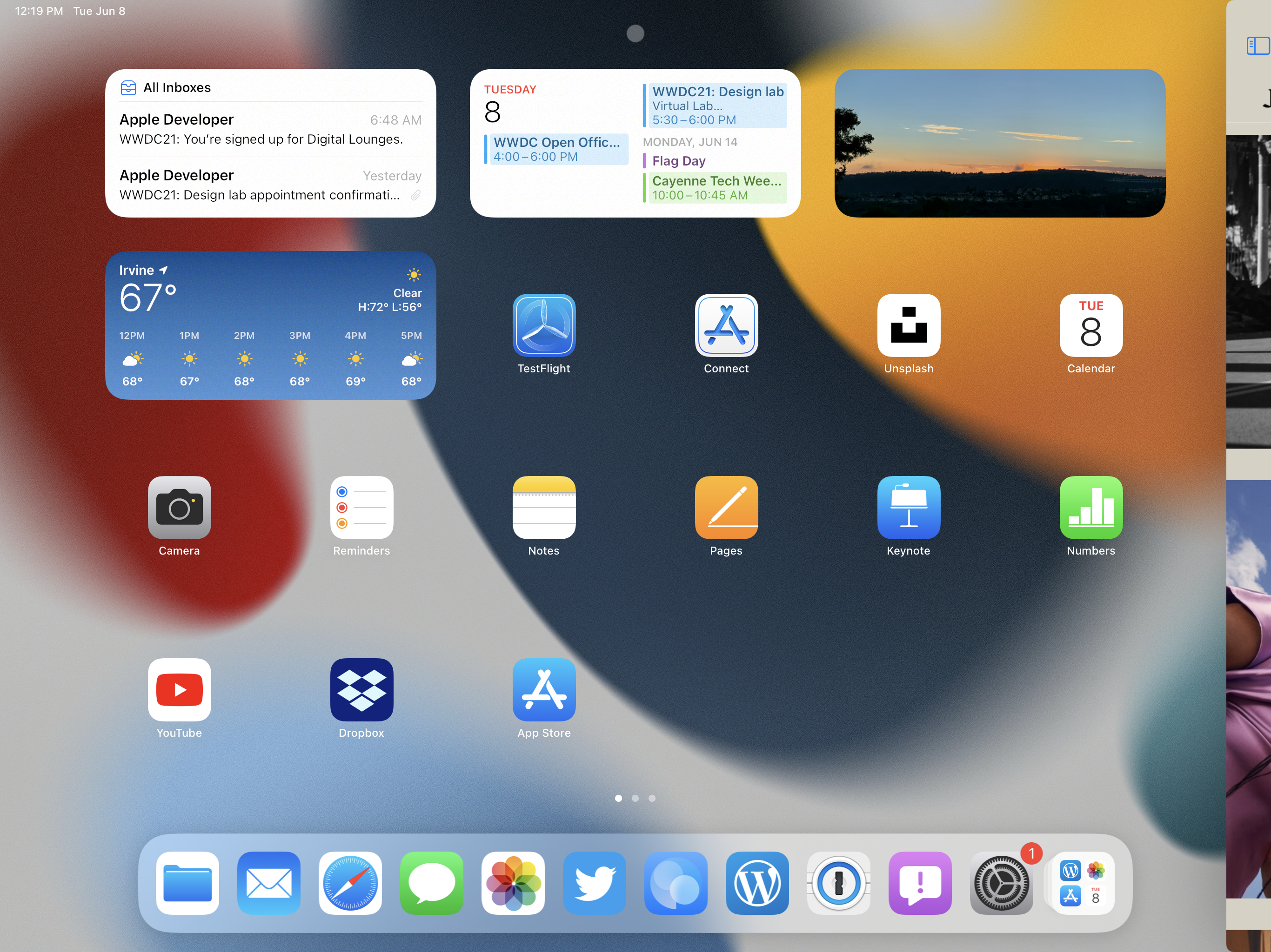
5. New Multitasking Affordances (AKA Visual Hints)
Apple debuted a pretty genius, simple improvement to the iPadOS Multitasking system. Now you’ll see a subtle “…” at the top of each window. Simply tap that icon and you’ll be greeted by a super simple switcher that helps you do multitasking. Want to take that app in Split Screen? There’s an icon for that. Want to take a Split Screen app back into fullscreen? There’s an icon for that too. These new buttons make multitasking way easier and more obvious by being always-visible.
6. A new notifications design called “Notification Summary”
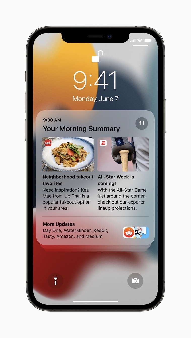
Apple also showed off a new way you can manage growing lists of notifications. You can now opt in to receiving a notification summary (pictured above) that collects a bunch of your notifications together into what looks like a miniature newspaper! This is a classic Apple design that organizes information in a way that’s easy to scan at a glance and jump into for more detail.
What did you think?
We’re just starting to explore the new designs presented at WWDC 2021 and can’t wait to get more experience with the new and updated operating systems. What was your favorite design from WWDC 2021? Let us know @detailsproapp on Twitter or on our contact page!